
A three-hundred-page compliance filing doesn't prove corporate leadership; it only proves your organization survived an audit. Master the discipline of how to visualize sustainability reports, and you transform dense regulatory obligations into an undeniable competitive advantage.You already know th...

A three-hundred-page compliance filing doesn't prove corporate leadership; it only proves your organization survived an audit. Master the discipline of how to visualize sustainability reports, and you transform dense regulatory obligations into an undeniable competitive advantage.
You already know the immense effort required to measure Scope 1 through 3 emissions, biodiversity benchmarks, and governance metrics across enterprise operations. Yet when those vital achievements remain trapped inside unread PDFs, stakeholder trust stalls, and the fear of perceived greenwashing looms large. This 2026 strategic guide shows you how to turn raw ESG disclosures into compelling visual narratives that preserve scientific rigor while driving measurable commercial impact. Ahead, we outline the repeatable frameworks required to craft authoritative, high-clarity visual assets that resonate with institutional investors, regulators, and the public alike.
• Moving beyond static PDF disclosures allows forward-thinking enterprises to transform complex ESG metrics into clear, high-retention stakeholder communication.
• Discover how to visualize sustainability reports using a strategic five-step framework that aligns raw performance metrics with core materiality priorities.
• Distinguish when static infographics satisfy regulatory filings and when dynamic ESG video or 2D and 3D animations are required to explain intricate operational progress.
• Safeguard corporate credibility by deploying rigorous data integrity standards that eliminate distorted charts, misleading visuals, and greenwashing liabilities.
• Identify the critical operational threshold where internal communication teams benefit from external creative partners who combine regulatory literacy with cinematic craft.
Enterprise disclosure is reaching an inflection point. Organizations compile massive dossiers detailing carbon intensity, human capital safeguards, and board oversight. Yet these disclosures routinely disappear into digital archives. Visualizing sustainability reports means translating technical ESG data into strategic graphic narratives; it converts raw spreadsheets into clarity that commands executive respect.
Dense, static files create friction. When an annual disclosure runs past one hundred pages, stakeholder engagement plummets. Financial analysts, institutional investors, and rating agencies operate under extreme time pressure. They don't sift through unstructured prose to assess climate risk; they scan for verifiable patterns, capital expenditure allocations, and operational velocity. Clean visualization provides immediate access to those truths. It strips away ambiguity, demonstrates accountability, and protects corporate reputation against accusations of performative commitment.
Forward-thinking organizations don't treat transparency as a defensive compliance ritual. Instead, they leverage the discipline of how to visualize sustainability reports to turn obligatory filings into an active brand differentiator that builds lasting enterprise equity.
Traditional compliance targets legal defensibility, but modern enterprise demands public resonance. A standard audit proves operational discipline; dynamic visual communication proves strategic intent. Foundational frameworks like sustainability reporting have evolved from voluntary corporate social responsibility notes into mandatory, rigorous scorecards. If your decarbonization trajectory remains locked in raw tables, your progress stays invisible.
High-impact visual communication transforms that equation by creating accessible, compelling proof:
Visual assets help distributed workforces and regional leadership understand operational net-zero targets faster.
Community leaders and non-governmental observers see clear, transparent water stewardship and resource conservation data without technical deciphering.
Visual milestones illustrate progress along multi-year timelines, demonstrating consistent capital execution year over year.
Capital allocators evaluate risk through pattern recognition. If an investment committee must read forty pages of dense notes to extract your Scope 1 and Scope 2 trajectory, your narrative loses momentum. Understanding the strategic role of a visual communication agency allows organizations to construct precise visual hierarchies that guide the executive eye toward strategic resilience. Well-architected data design isolates critical metrics, connects operational milestones directly to governance frameworks, and demonstrates that sustainability isn't an isolated reporting burden, but a core driver of corporate longevity.
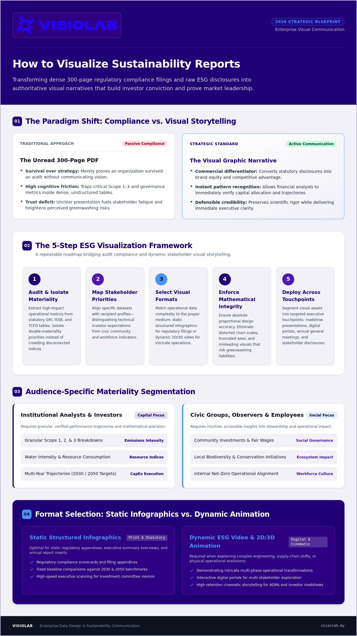
Turning dry technical filings into persuasive executive communication demands an engineered process. Random charts pasted into slide decks do not build investor conviction. To master how to visualize sustainability reports, sustainability committees require a repeatable blueprint that bridges audit compliance and dynamic visual storytelling.
Extract high-impact operational metrics from statutory tables.
Align specific datasets with investor, employee, or community expectations.
Match complex data to diagrams, dynamic charts, or narrative sequences.
Ensure absolute proportional integrity and contextual clarity across all assets.
Segment content into high-impact formats for roadshows, websites, and shareholder meetings.
Every effective visual starts with rigorous subtraction. Begin by auditing technical disclosures across GRI, ISSB, or TCFD tables to isolate double-materiality priorities. Don't crowd ten disconnected indices onto one canvas. Instead, track baseline emissions against interim 2030 and 2050 targets to highlight verified performance trajectories.
Segment these verified indicators by audience needs. Institutional analysts demand granular Scope 1, 2, and 3 breakdowns and water intensity indices. Conversely, civic groups and employees look for community investments, fair wages, and biodiversity initiatives. Clear grouping prevents message dilution.
Static infographics work well for statutory appendixes, but complex operational evolutions require dynamic presentation. Leading institutions rely on interactive data visualizations to make extensive sustainability metrics accessible to global observers. When explaining capital reallocation or multi-tier supply chain decarbonization, kinetic visuals succeed where flat tables fail.
Integrity is paramount. Establish clear graphic design guardrails: baseline zero axes on bar charts, mathematically scaled area bubbles, and honest trend lines. Pair every metric with precise microcopy that contextualizes operational context without burying the reader in jargon.
Never treat a published disclosure as the end of your campaign. Break the core narrative down into bite-sized motion pieces, executive summary decks for annual general meetings, and investor relations collateral. Leveraging strategic explainer video production allows corporate teams to transform intricate operational methodologies into concise, high-retention media suites. If your internal committee wants to elevate annual disclosures into authoritative brand assets, explore how VISIOLAB translates complex sustainability narratives into broadcast-grade executive media.
Every medium serves a tactical function. Static diagrams deliver precision; dynamic video commands attention. Choosing between them isn't an artistic preference, but an operational decision based on audience psychology and communication objectives. Knowing how to visualize sustainability reports across formats ensures your organization matches the right vehicle to the right stakeholder.
Static graphics provide permanence. When audit committees, rating analysts, and regulatory bodies evaluate compliance, they require fixed reference points. Conversely, when communicating strategic transformation to retail investors, commercial partners, or internal teams, static tables fall flat. Dynamic media introduces sequence, pacing, and human emotion. Rather than choosing between these two modes, modern enterprises deploy an integrated hybrid strategy: anchoring technical methodologies in structured appendices while spearheading stakeholder communication with high-impact corporate film and motion graphics.
Static formats form the empirical backbone of annual disclosures. They ensure regulatory clarity across corporate decks, fact sheets, and statutory filings. Use static diagrams and interactive online dashboards for:
Displaying audited accounting methodologies and reference baselines that demand deliberate, line-by-line inspection.
Enabling portfolio managers to filter five-year performance curves across energy intensity and water usage.
Presenting board diversity distributions, risk matrices, and committee oversight protocols cleanly on a single static slide.
Complex engineering transformations don't translate easily onto flat pages. Showing how an enterprise replaces legacy fossil assets with distributed renewable infrastructure requires visual progression over time. Through 2D and 3D animations, companies can visualize invisible phenomena, including fugitive methane reduction pathways, closed-loop industrial recycling, and Scope 3 supply chain realignments.
Live-action corporate video brings unmatched emotional authority to the table. Filming on-site biodiversity restoration, worker safety protocols, and local vocational programs turns cold statistics into tangible proof. Collaborating with seasoned specialists in ESG video production enables enterprises to bridge the gap between abstract compliance targets and genuine community impact. Viewers don't just read about ethical leadership; they see operational integrity at work across enterprise facilities.
Visual excellence without empirical discipline invites disaster. Global regulators, institutional investors, and civic watchdogs actively scrutinize sustainability disclosures for exaggerated claims. When evaluating how to visualize sustainability reports, the cardinal rule remains absolute: visual design must illuminate data, never distort it. A stylized graphic that conceals an emissions spike doesn't just erode executive credibility; it triggers severe reputational damage and legal liability.
Authentic storytelling requires radical honesty. Credible enterprises openly disclose operational roadblocks alongside significant milestones. Highlighting supply chain bottlenecks or temporary setbacks alongside your decarbonization victories shows maturity. Transparent disclosures disarm critics, while selective omission guarantees scrutiny.
Deceptive design tropes can instantly destroy years of corporate equity. Design teams must enforce strict mathematical discipline across every chart, infographic, and dynamic frame:
Truncating the vertical axis on a bar chart to make a modest two percent reduction resemble an eighty percent plunge creates deceptive optics. Always anchor comparative scales to an honest zero baseline.
Bubble charts and volumetric diagrams must scale strictly by surface area rather than diameter; doubling a circle's radius quadruples its visual footprint and misleads viewers.
Display data collection boundaries, baseline reference years, and independent third-party assurance markers directly within lower-third captions and graphic footnotes.
Visual assets cannot exist in a vacuum separated from regulatory realities. Narrative content must synchronize with frameworks like GRI Universal Standards, IFRS S1 and S2, and Bursa Malaysia sustainability reporting directives. Keep uncommitted, forward-looking aspirations clearly distinct from verified historical reductions. If a 2040 net-zero pathway depends on unproven carbon capture technologies, identify it explicitly as a strategic projection rather than an achieved capability.
Establish structured review protocols where corporate sustainability directors, legal counsel, and visual media teams audit storyboards against statutory filing sheets. To turn complex environmental and social metrics into audit-proof executive communication, partner with VISIOLAB to develop compliant ESG video narratives that balance cinematic impact with uncompromising technical precision.
Every enterprise reaches a visual ceiling. Internal corporate affairs and sustainability units excel at gathering cross-departmental data, conducting greenhouse gas audits, and ensuring statutory filing precision. Yet expecting compliance professionals to execute broadcast-grade motion graphics or cinematic narrative storytelling strains internal resources. When static outputs fail to move capital allocators or energize employees, bringing in external production muscle becomes a strategic necessity.
Mastering how to visualize sustainability reports at the highest enterprise level requires marrying technical ESG fluency with world-class media production. The right creative partner functions as an extension of your sustainability committee. They turn annual reporting deadlines from a compliance burden into a landmark media event that amplifies your organizational legacy nationwide.
General commercial video shops often falter when confronting double-materiality matrices and Scope 3 supply chain protocols. When auditing external agencies, look for specialized acumen rather than generic showreels:
The partner must comprehend carbon offsets, diversity metrics, and regulatory mandates without needing basic corporate training.
True narrative power requires moving effortlessly between dynamic infographics, 2D and 3D animations, aerial site cinematography, and C-suite interviews.
Prioritize studios with demonstrated experience navigating approvals across legal, corporate affairs, and investor relations departments.
For a complete strategic evaluation framework, explore our guide on choosing a video production agency for enterprise communication.
As a nationwide visual partner for public listed enterprises, multinational corporations, and government-linked entities, VISIOLAB bridges strategic intent and high-impact visual execution. We don't view ESG metrics as abstract numbers; we treat them as chapters in an ongoing corporate transformation story.
Our team integrates executive storytelling with custom 2D and 3D motion design, turning intricate decarbonization initiatives into compelling visual assets for investor roadshows and shareholder assemblies. Rather than settling for unread documentation, learn how to turn annual disclosures into persuasive, multi-platform media assets through VISIOLAB's corporate media services.
Static annual disclosures protect compliance, but dynamic visual narratives build enduring corporate authority. As enterprise transparency faces heightened scrutiny, knowing how to visualize sustainability reports bridges the critical divide between complex carbon data and executive stakeholder belief. By isolating double-materiality priorities, pairing rigorous data integrity with cinematic media, and deploying across multi-channel touchpoints, forward-thinking organizations turn obligatory filings into powerful reputation drivers.
True sustainability leadership demands both creative mastery and audit-level precision. With a proven track record delivering strategic corporate films and high-impact ESG stories for major national enterprises, VISIOLAB unites 2D and 3D motion graphics, aerial capture, and executive storytelling into cohesive media suites. It's time your sustainability achievements received the visibility they deserve. Ready to command stakeholder trust? Transform your sustainability disclosures into strategic visual narratives with VISIOLAB.
Focus on your double-materiality matrix and core strategic pillars. Extract metrics where operational changes delivered substantial shifts, such as Scope 1 and 2 reductions, safety incident rates, or community investments. When planning how to visualize sustainability reports, prioritize figures that demonstrate tangible capital allocation over routine operational maintenance. Leave secondary compliance tables in statutory appendices, reserving dynamic visual formats for high-priority executive narratives.
Yes, if creative design distorts underlying data or overstates progress. Misleading scaling, truncated chart axes, or highlighting minor green initiatives while obscuring emissions increases will trigger regulatory penalties and public backlash. To prevent exposure, ensure every visual narrative mirrors audited disclosures exactly. Include clear baseline years, data collection boundaries, and third-party assurance references within on-screen captions or footnotes.
Static infographics capture single-point metrics and comparative ratios, serving as ideal reference documentation for investor presentations and annual filings. Motion graphics and animated video introduce temporal progression, spatial depth, and narrative context. While a static chart shows an emissions total, motion design illustrates how complex supply chain transitions or closed-loop recycling processes actually function over time, driving significantly higher stakeholder retention.
Institutional investors prioritize structured clarity: interactive web dashboards, downloadable data sheets, and concise executive video summaries that unpack capital expenditure alongside decarbonization roadshows. The broader public, civic partners, and employees respond better to documentary-style corporate films, human interest features, and kinetic social snippets. Tailoring format delivery ensures technical rigor for analysts while inspiring broader public advocacy.
Production timelines depend on project scope, visual complexity, and executive review cycles. A comprehensive media package spanning script development, data storyboarding, 2D or 3D animations, on-site filming, and C-suite interviews typically requires several weeks to coordinate across sustainability, legal, and communications teams. Beginning production well in advance of annual statutory filing deadlines ensures seamless cross-departmental alignment and broadcast-grade finishing.
Visual structures should align directly with recognized global reporting standards, including GRI Universal Standards, IFRS Sustainability Disclosure Standards (S1 and S2), and local listing requirements from Bursa Malaysia. Structuring graphic themes around established disclosure pillars ensures institutional credibility. When designing how to visualize sustainability reports, maintaining direct conceptual alignment with formal audit categories prevents confusion during stakeholder evaluation.
Video transforms compliance overhead into active enterprise value. For public listed entities and GLCs, annual PDF reports rarely command deep engagement from global capital markets or domestic stakeholders. Cinematic ESG video and motion graphics provide an authoritative, multi-channel medium for investor roadshows, annual general meetings, and corporate websites. This visual approach builds authentic corporate legacy and reinforces transparent market leadership nationwide.
Let’s create and collaborate
We’re versatile multitaskers, and we thrive on a lot of projects. You've seen a few of our works that we are most proud of, and your project could be next in line.

Empowering brands with captivating visual stories, creating strong connections and growth.
